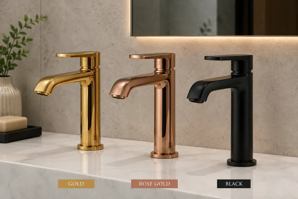
Choosing Your PVD Finish: Gold, Rose Gold, Black, Bronze & Beyond
A working guide to the MOTIF finish palette — what each tone pairs with, how light changes it, and what to ask for when specifying.
The palette, tone by tone
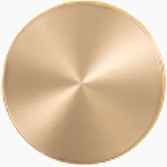
Classic gold. The titanium-nitride standard — warm, confident, and the closest thing to polished brass that never tarnishes. Pairs naturally with deep greens, navy, marble and dark timber. In bright daylight it reads regal; under warm interior light it softens toward honey.
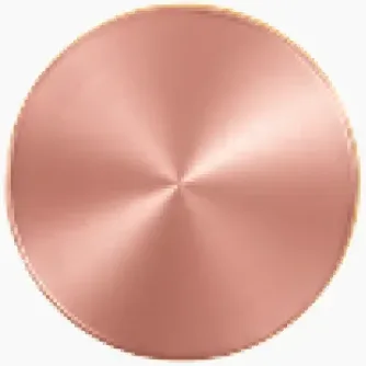
Rose gold. Gold with a copper blush. It flatters pastels, blush stone and pale timber, and it photographs warmer than it looks in hand — worth remembering for hospitality and retail interiors that live on camera.
Bronze and antique tones. The heritage register: quieter than gold, richer than gunmetal. These tones ground traditional interiors and give contemporary spaces age and weight without pastiche.
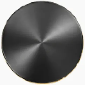
Black. The modern workhorse — matte to gloss, it frames everything and argues with nothing. Black PVD keeps its depth where black paint goes grey at the edges, which is why it dominates premium door hardware and kitchen fittings.
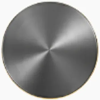
Gunmetal and champagne. The in-between tones: gunmetal for technical, masculine schemes; champagne where gold would shout and silver would disappear.
Texture is half the finish
Every tone changes character with the surface under it. Mirror-polished gold is opulent; brushed gold is architectural; bead-blasted gold is almost industrial. When specifying, name both the tone and the texture — and ask for samples in the actual texture, because photographs flatten the difference.
Three questions before you specify
- What light will it live in? North-light interiors cool every tone; tungsten warms them.
- What does it sit next to? Bring the stone, laminate or paint card to the sample meeting.
- How will it be touched? High-touch surfaces favour brushed and satin textures, which wear invisibly compared to mirror.
Our team can prepare finish samples against your material board — request them through the contact page.